Responsive Store Pages
Redesign of the Walmart store finder and store pages with better data, improved hierarchy and surfacing of information, and new visual style
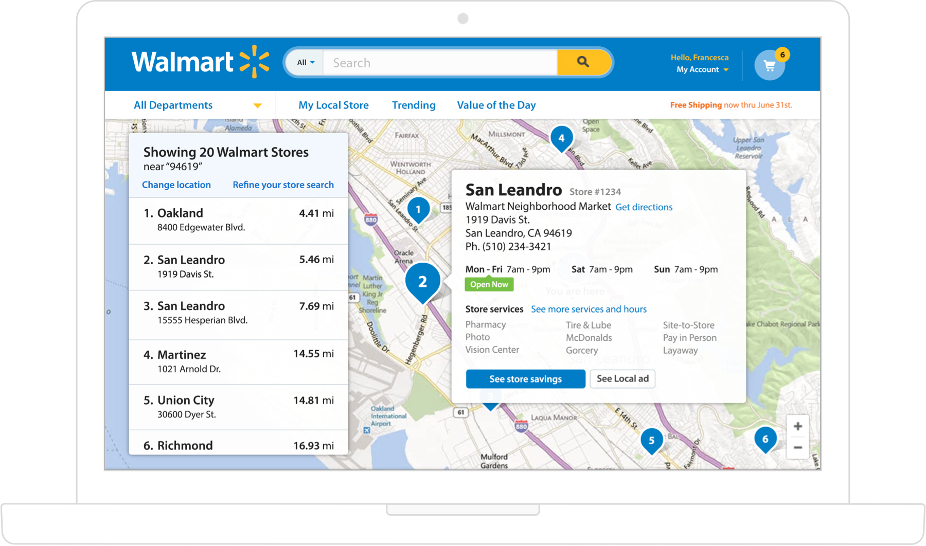
Store Finder
A web feature that displays nearby stores based on location and surfaces relevant details. This page acts as an entry point for individual store pages, local circular ad, and other store specific information. Our customers often shop multiple stores on a regular basis. Seeing all nearby stores and being able to quickly glance at hours and other important store details proved a giant improvement over our previous experience.

Store Details
The majority of organic traffic would land customers on this page which includes an exhaustive list of details and store information. We wanted customers to get the information they needed as quickly as possible which is why we added logic and called out "Open Now" in a flag near the store hours.
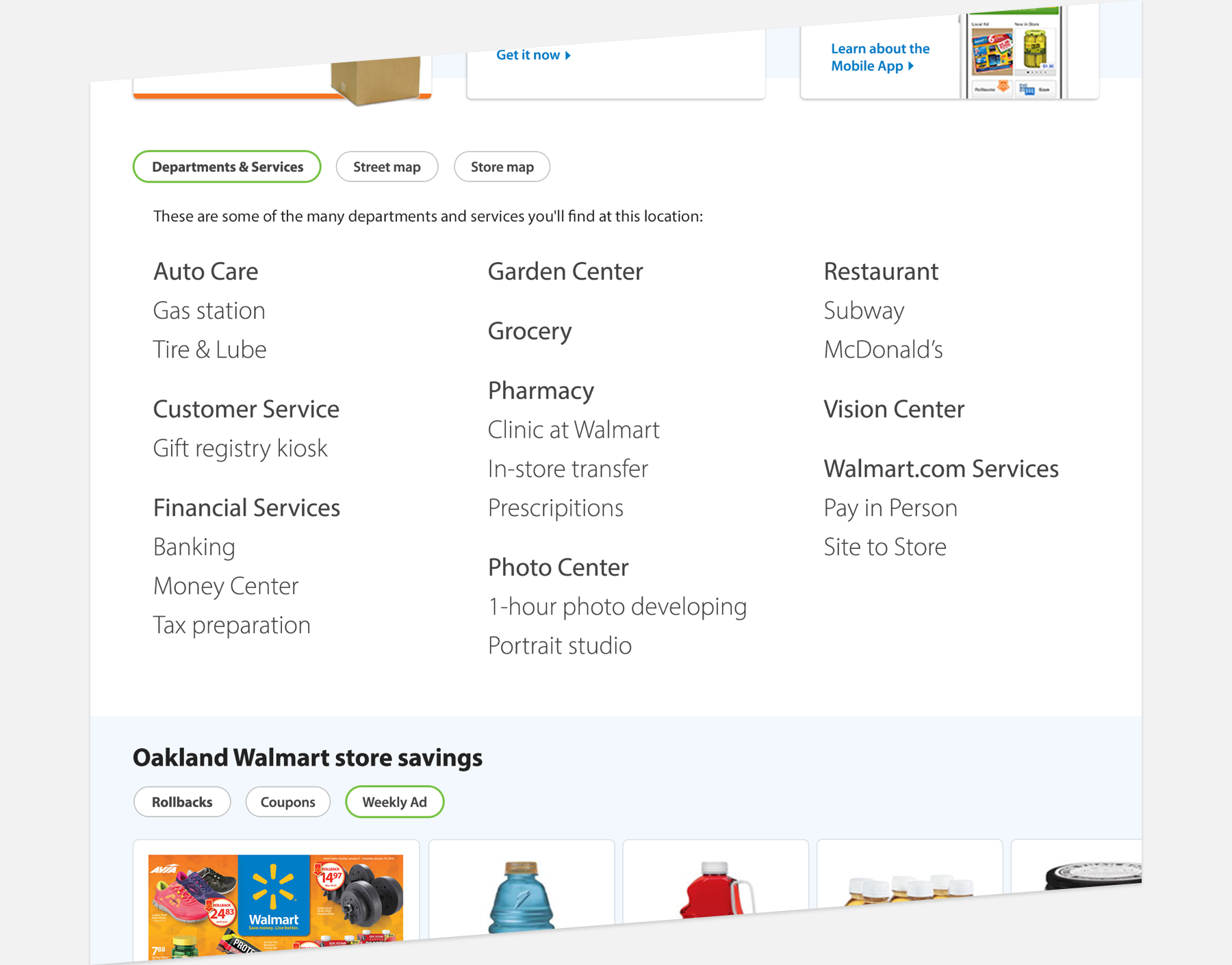
Department list and maps
Further down the page a clean and readable display of the full department offering helps customers know what each store offers. Augmenting the data to provide 2-tier hierarchy within the department list helped us design a more organized department list. Customers could also tab between a street map to the store and even an in-store map.
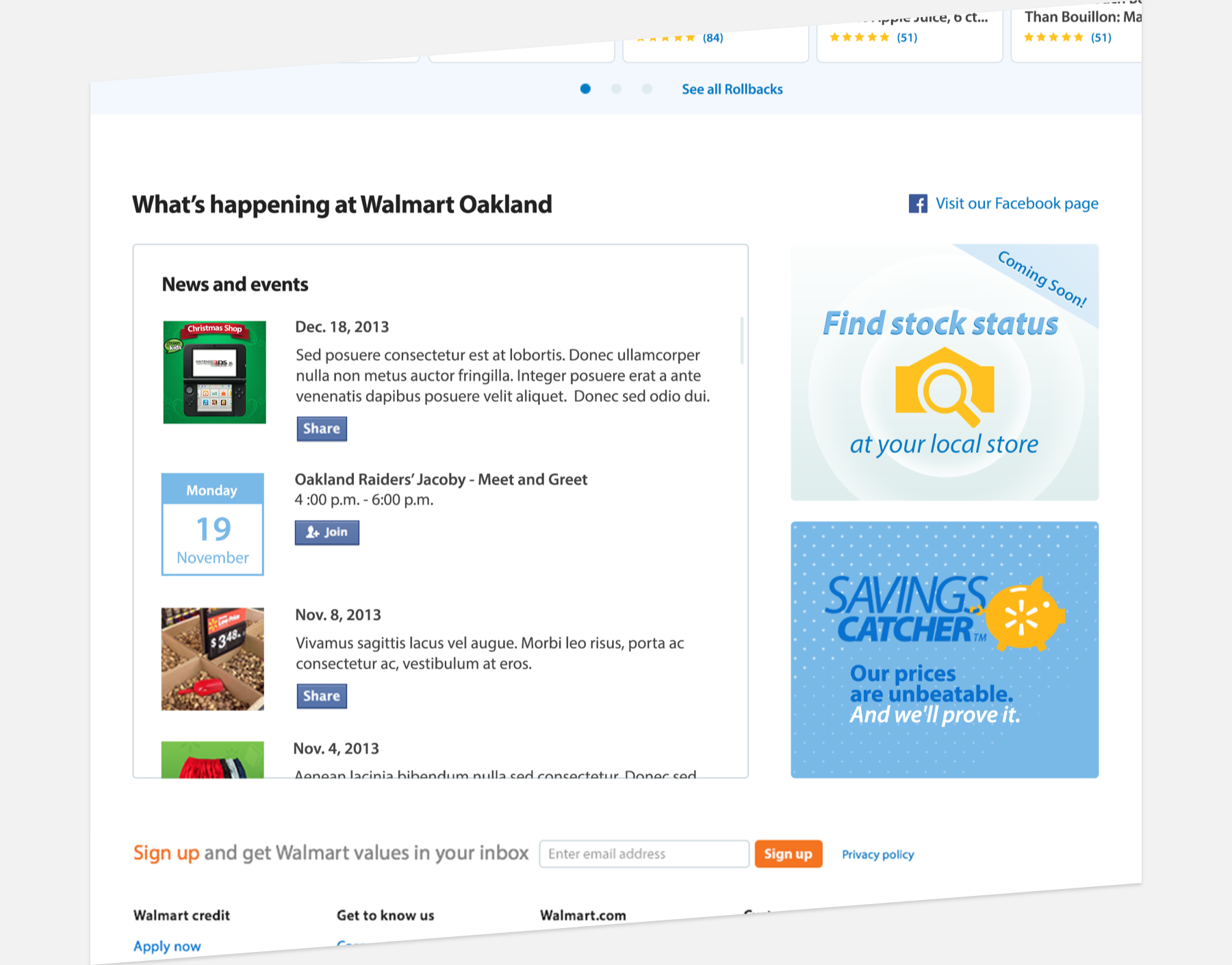
Social feed and marketing
A large majority of Walmart store managers run a Facebook feed to notify customers about stock, exclusive merchandise, or store events. We brought that into the page and also gave marketing two modules to push store related features and products.