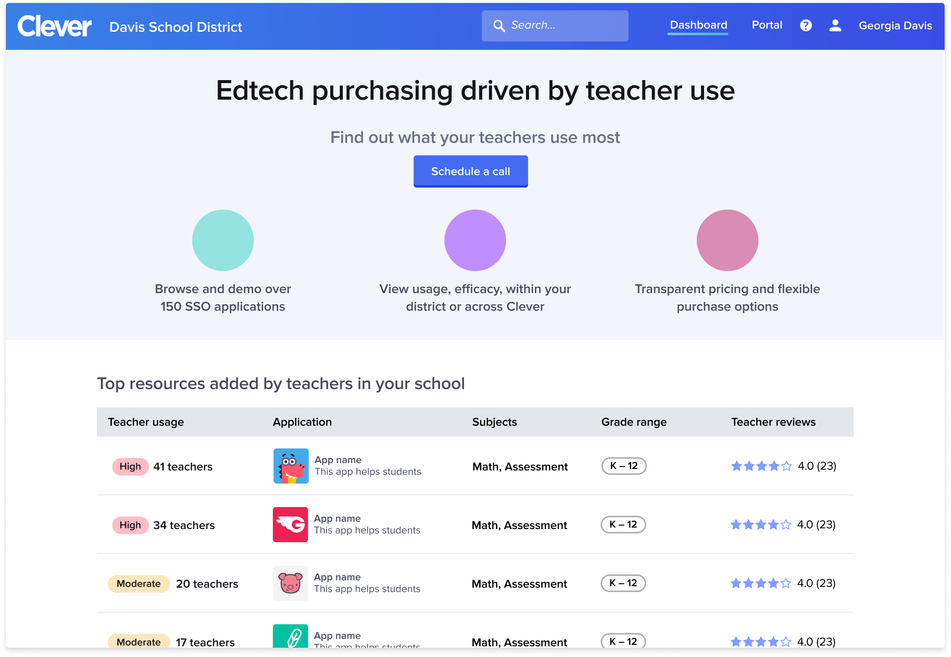
Goals and context
K–12 school districts have a hard time making informed edtech (education technology) purchasing decisions. Clever’s Instructional App Store (working name) is a place within district and school administrator dashboards where they can shop for software based on qualitative and quantitative teacher and student data. This highly relevant usage data comes from the Clever Library, the teacher facing version of the same app catalog. The minimum viable version of the Instructional App Store was hacked together with existing modules from our teacher-facing experience. Our goal was to redesign the experience to be highly relevant to administrators and increase our lead generation rate as a result.
Understanding our customers
District administrators were our target user type, however, district admin titles varied greatly. We further focused our research on purchase decision makers and influencers, which built upon research we’d done in our work for School Tech Leads.
Through interviews and discussions with numerous purchasers, we found a common pattern in their purchasing behavior. Mapping their journey alongside the then current feature set allowed us to understand where we were falling short.
Landing page explorations
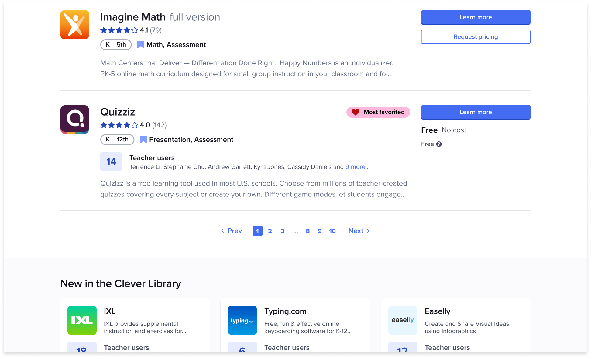
After admins landed on our App Store, we wanted our page design to evoke a purchasing mindset, and leverage Clever’s unique data. With those goals in mind, we explored and tested various layouts. We learned our shoppers were most interested in seeing relevant usage data (i.e. usage in their school) tied to each listing. Over a few rapid iterations, we aligned on a single column of usage-centric app listings, sorted by relevance (high usage).
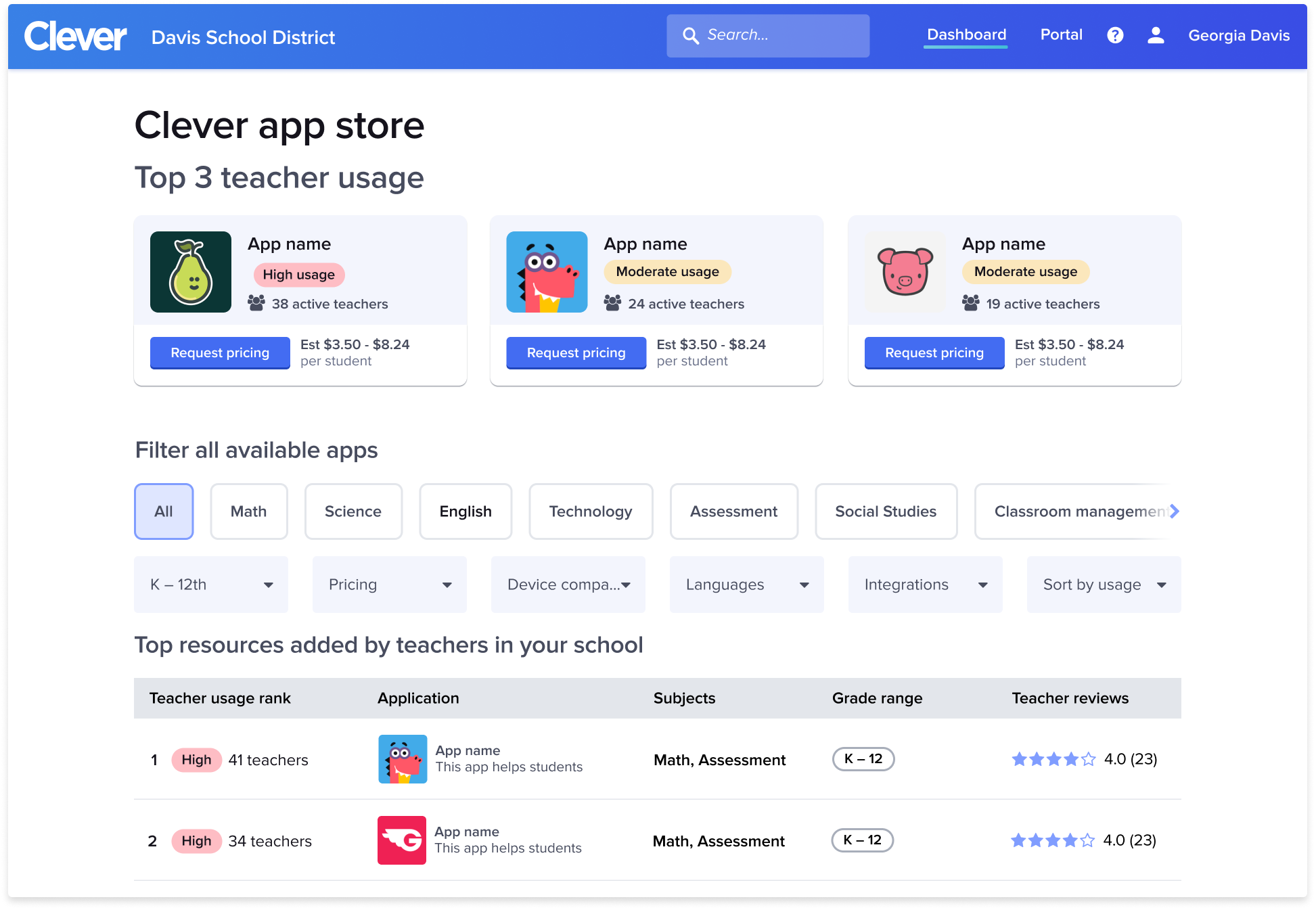
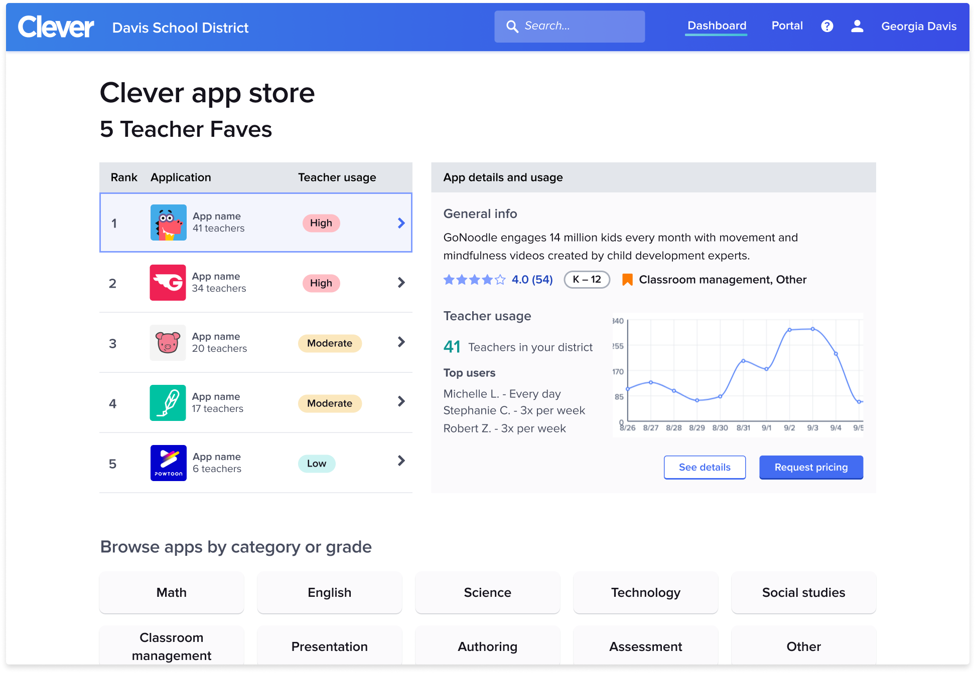
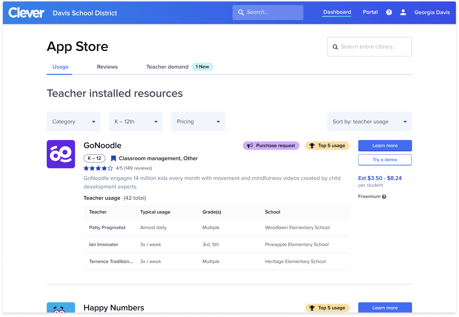
In parallel, the app detail page needed to accommodate additional pricing and usage data while also organizing information in a more scannable way to satisfy the “sniff test” part of the purchase journey. With minimal time to deliver, we restructured the information hierarchy, cleaned up the call-to-action area, incorporated the new data, and added anchor linking to navigate up and down the page.

Compelling data
Continued interviewing revealed deeper insights into admin purchasing behavior. If we could surface the teacher voice to admins, it would prove to be our most compelling data. We set about incorporating the purchase request into our designs. We worked to minimize effort on the teacher side by condensing the purchase request form into 3 inputs that were most helpful to our admins. Highly engaged teachers were prompted to provide purchase requests in an unobtrusive way based on logic we’d built for previous prompts.
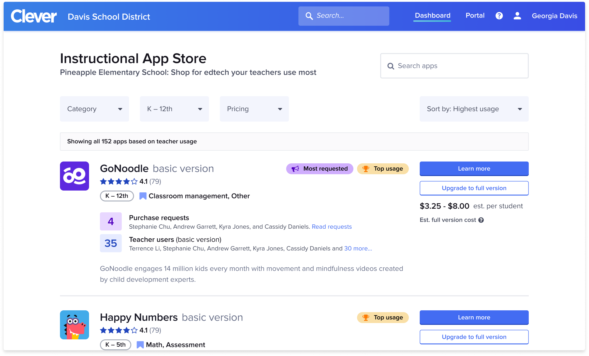
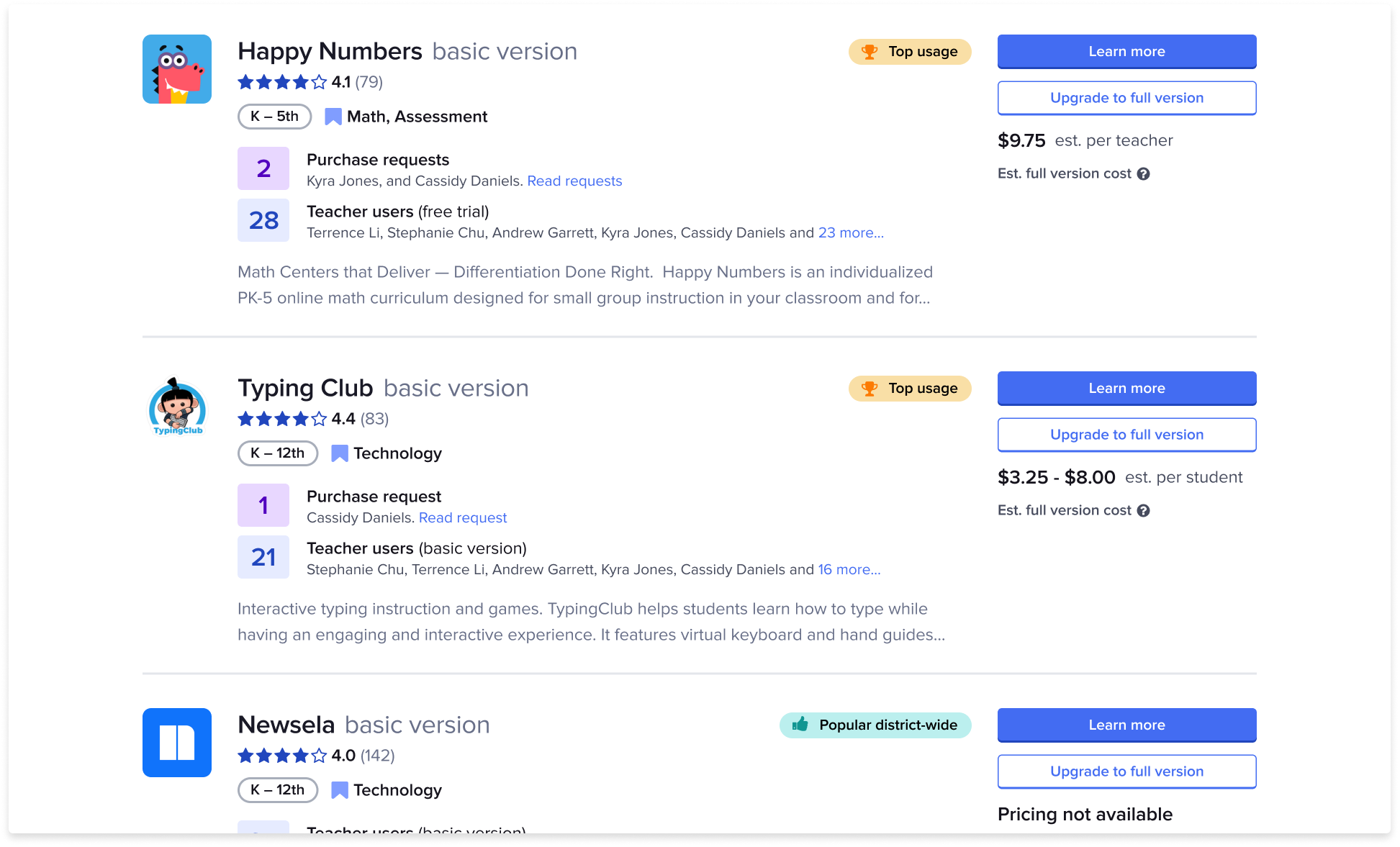
Prototype iterations began to incorporate purchase requests high into the usage data hierarchy. In our usability studies, admins were immediately drawn to purchase requests– helping them see where their spending will have the highest impact.
Initial results
Early indications of success as of December 2020
Lead generation rate increased from 0.01% to 2.6%
Landing page click through rate increase
Positive usability test responses
Key learnings & next steps
Open top-of-funnel
We could have increased our learning velocity if we had opened the very top-of-funnel triggers first. More traffic at the top would help us experiment more rapidly in middle and lower parts of the funnel.
Design for scale
The purchase request interface elements were not designed to scale, and this will need to be addressed as the feature continues to grow.
Special thanks to the wonderfully amazing Disco Team and cross-functional teams at Clever who collaborated on this project.